In today’s complex cloud environments, tracking the health of your applications and their dependencies is more than just monitoring raw metrics—it’s about understanding true business impact. If your payment system stalls or your APIs slow down, customers feel it instantly.
Traditional monitoring with dashboards, metrics, and alerts gives us critical data, but not always context. What we really need is a way to understand whether a workload as a whole is healthy, available, and resilient against failures.
Enter Azure Monitor Health Models (preview), a powerful feature that enhances monitoring with meaningful health signals and visualization.
TL;DR
What are Azure Monitor Health Models?
Azure Monitor Health Models allow you to define and track the health of your workloads through an intuitive modeling experience. They extend traditional monitoring by adding business context, establishing a health baseline that reflects the what matter the most for your business.
Instead of looking at each resource in isolation, health models show how components interact and roll up into the overall health of the system.
Azure Health models is built on top of the following key concepts:
- Signals: Metrics or log queries that collectively determine the health rating of a component is Healthy, Degraded, or Unhealthy. You can use built-in recommended signals or define custom ones.
- Entities: Components of your workload (VMs, Event Hubs, APIs, Functions, etc.) modeled visually in a graph.
- Propagation: If one component fails (e.g., Event Hub under pressure), the failure cascades upstream, showing its effect on dependent components providing an aggregated health score for your entire workload.
- Health State: Instead of dozens of noisy alerts, you get a single contextual answer: “Is my app healthy?”
Why Health Models Matter?
Health models matter because they reduce alert fatigue by surfacing meaningful, business-impacting issues and accelerate troubleshooting by mapping failures to customer-facing features.
They also enable automation by plugging into the Azure monitor alerting system allowing health-driven actions. Even more important, they align monitoring with business context by shifting the focus from raw technical metrics to the health of critical user journeys that truly reflect end-customer experience.
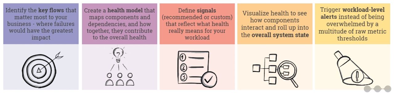
Use case
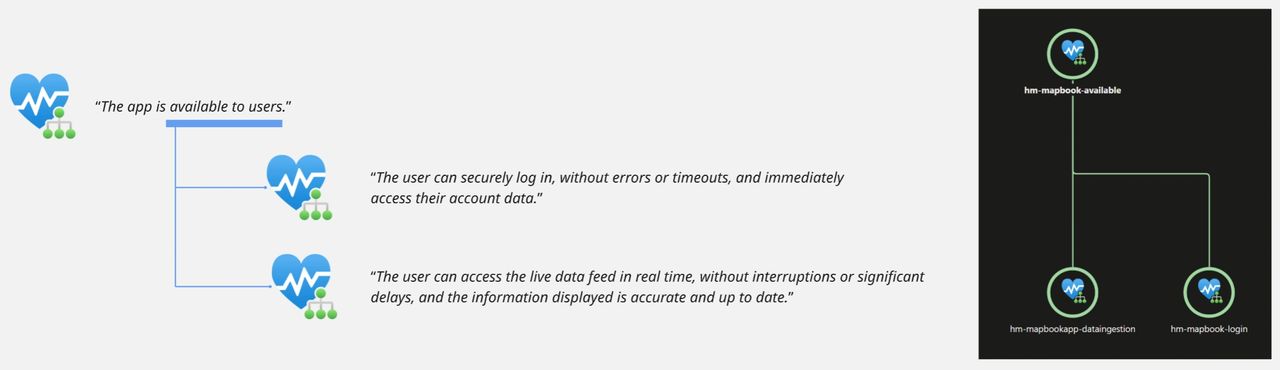
Moving from monitoring to resilience requires several steps, and it all starts by defining the critical flows—the key user journeys such as login, account setup, or checkout—that your business depends on.
By identifying these flows upfront, you can create a clear view of which parts of the application are most important to protect, ensuring that resilience efforts focus where failures would have the greatest impact on customers and business outcomes.
ℹ️ In our fictional case, the organization identified the “live data feed” as business-critical and described the health of this function with these words: “The user can access the live data feed in real time, without interruptions or significant delays, and the information displayed is accurate and up to date.”
Building and Configuring Your Health Model
The next step is to take the definition of a healthy flow and break it down into the technical components and dependencies that support it—such as databases, APIs, messaging services, or third-party systems—so you can clearly see how these elements interact, and then capture them in a health model that reflects how their state directly impacts the users.
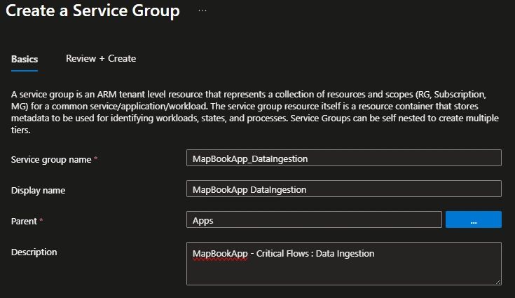
Start with a Service Group
Health models are built upon service groups, which group resources (across resource-groups, across subscriptions) that work together in your workload. In our example we create a service group called “data ingestion”.
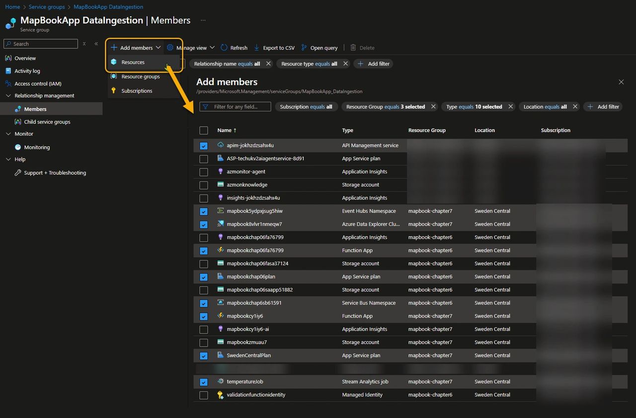
Now that we have a brand-new service group, we can add all the resources that contribute to the health of the “live data feed” critical flow. This functionality relies on components spread across two resource groups (frontend and data ingestion), along with a shared API Management instance from a centralized hub.
By clicking Add members, you can search for the relevant components and filter by properties such as subscription, resource type, and more. As shown in the picture below, some resources—such as Application Insights and the Storage Account—are required for the MapBookApp to function, but since they are not critical to the “live data feed” flow we want to monitor, we won’t include them in the service group.
Create an Health Model
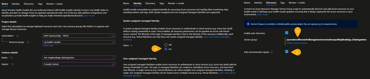
Now, let’s create an Azure Health Model resource named hm-mapbookapp-dataingestion and:
- a) configure it to use a system assigned identity. Note that identity used by the health model should have at least reader permission to fetch the resources contained in the service group and all the azure monitoring related resources like Log Analytics workspace and Azure Monitor workspace.
- b) enable auto discovery and associate the “MapBookApp_DataIngestion” service group to the health model. Azure automatically picks up the resources included in the service model as health model entities. The model stays up to date as resources are added or removed from the service group.
- c) by clicking Add recommended signals, the health model will apply Microsoft’s suggested signals to determine the health of the service. This is especially useful when using a service for the first time, as it helps you quickly understand which metrics matter. However, in real-world scenarios every application is unique, so it’s best to define your own signals and thresholds to reflect the specific requirements of your workload.
Configure your Health Model.
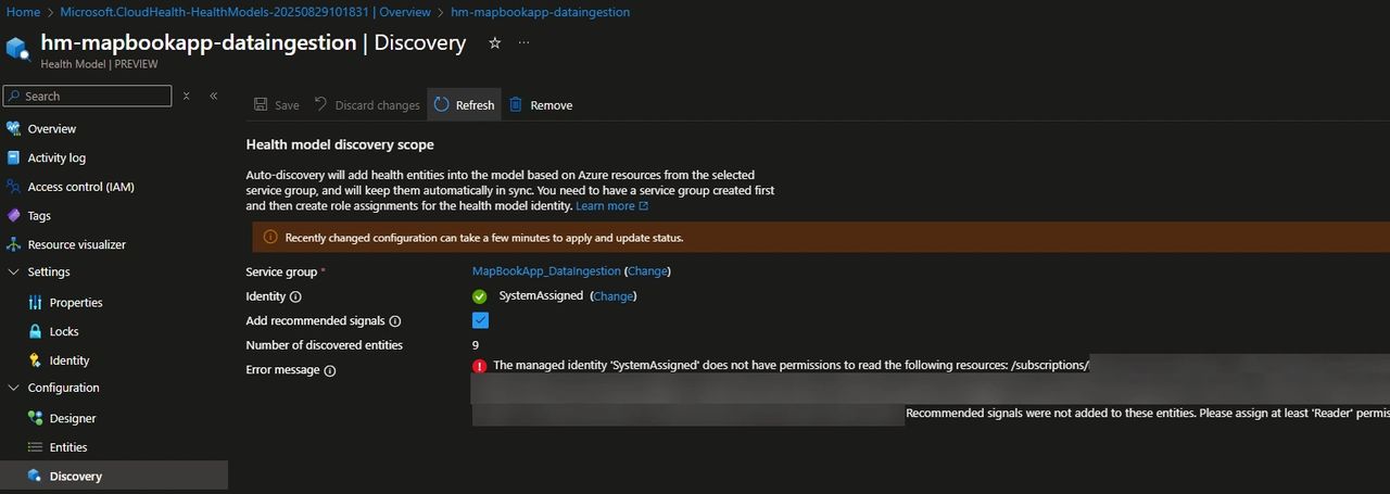
Once the model is created, go to the discovery menu to verify whether the Health Model can access the resources contained in the service group and add the recommended signals. Add at least the Reader permission to the resources/resource groups involved.
Go to the Entity menu to see the results of the discovery along with the recommended signals that are automatically created. In our use case, alongside the list of monitored components, you can observe the following :
- a) The type of signals associated with each resource. For example, here you can see that only metric alerts are contributing to the health of the resource.
- b) The overall health state of the resource, derived from its signals. Some resources may appear as Unknown because, at that point in time, the metric data was not yet populated.
- c) The automatically discovered metrics provide a good starting point, but they don’t always align perfectly with the workload. You can edit them to fine-tune values such as thresholds, aggregation windows, and other parameters, or remove the irrelevant ones and replace them with signals that better reflect your specific scenario.
- d) Out-of-the-box metrics aren’t always sufficient to represent the true health of a component. When needed, we can define custom Log Analytics queries to capture more meaningful signals.
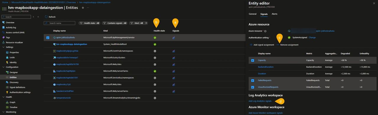
In MapBookApp use case, we lowered the APIM capacity thresholds and added a Log Analytics query that calculates the failure percentage based on logic tailored to this use case.

Configure the dependency hierarchy
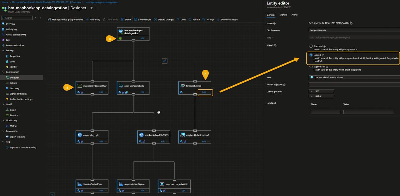
Let’s now move to the Designer, a very intuitive tool to visually edit entities and create a map that defines how health signals propagate up to the root entity and how they contribute to the overall health of your flow.
When you open the Designer for the first time, all components are directly linked to the root element, one-level, flat hierarchy. From there, you can reorganize and refine the structure to better reflect how your application actually works.
In our case, we used the visual editor to:
- a) Implement a three-level hierarchy, grouping related components under intermediate nodes rather than connecting everything directly to the root.
- b) Adjust how severity propagates, so that the impact of an unhealthy Stream Analytics job is reflected differently by its parent node, giving a more accurate representation of its importance to the overall flow.
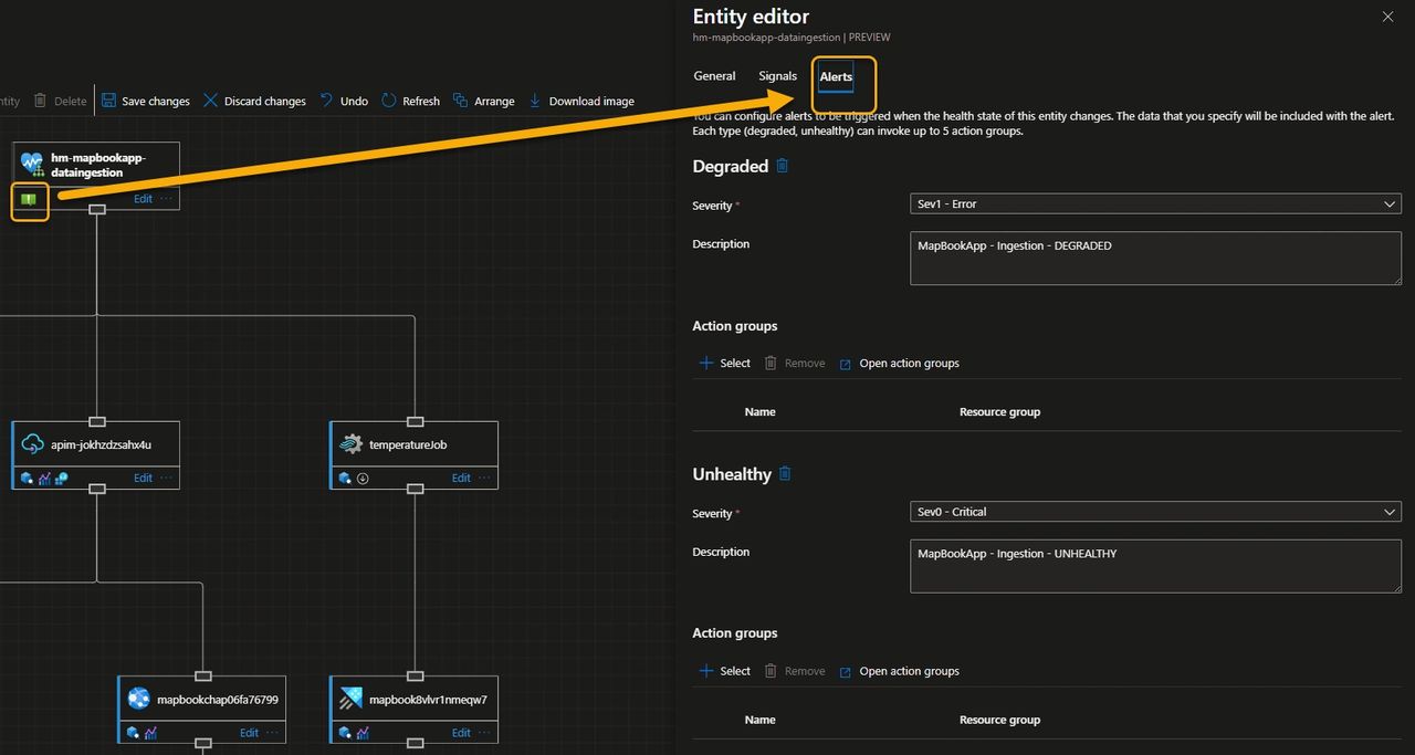
- c) Add alerts to the root node, configured to trigger whenever the overall flow moves into a Degraded or Unhealthy state.
Visualize the health intuitively
Azure Health Model provides two main ways to see health: a Graph view, which offers a real-time visual of workloads and dependencies with color-coded states, and a Timeline view, which shows historical health for trend analysis and root-cause exploration.
We waited a few minutes, grabbed a small coffee, and let the data flow through our application, giving the health model time to collect signals and reflect the state of the system.
The Graph view clearly showed how the signals bubbled up to indicate a healthy flow 💪. But a little later, the overall health turned red, signaling that something was wrong as one of the underlying components had entered an unhealthy state.
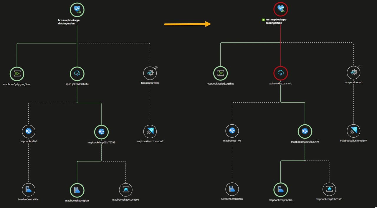
Clicking on any entity in the graph reveals its current health state along with everything you need to analyze the model—signals and their values, health history over time, active alerts, and more.
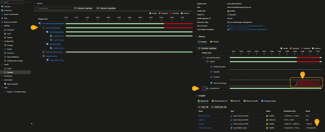
In this example, however, I chose to switch to the Timeline view to analyze how the anomaly evolved over time. In the screenshot below, we can observe the following:
- a) The unhealthy state originates from one or more API Management signals.
- b) All API Management dependencies remain green.
- c) For about 10 minutes, the failure percentage was around 80%, after which it gradually decreased until the component returned to a healthy state.
- d) Everything is now back to normal, with the failure percentage stabilized at 4.95%.
Alert on Health, Not Just Metrics
Now that our critical flow is mapped to a Health Model—and we’ve defined what healthy means for us and how different signals roll up into an overall state—we can generate alerts based on workload-wide health instead of triggering a multitude of alerts on raw metric thresholds.
For the sake of simplicity, we created a single alert at the root level to capture both the Degraded and Unhealthy states. However, you can also configure multiple alerts at different levels of your hierarchy — for example, to catch degraded states that bubble up with lower impact.
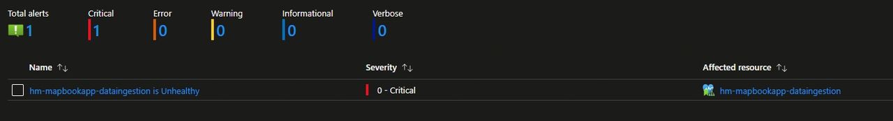
Finally, the image below shows the alert generated by the transient unhealthy state we experienced because of the high amount of failed requests. This alert is ready to be picked up and dispatched to the notification channel of your choice.
As a best practice, I recommend not attaching an action group directly to an alert rule; instead, use Azure Processing Rules to subscribe to the alert and handle its dispatch.
🏁Result: All the individual metrics contributed to a single health signal (Healthy, Unhealthy, or Degraded). This approach is not only clean but also drastically reduces alert noise, while keeping the focus on business-level issues within the familiar Azure Monitor experience.
🤯 Note that you can even create health models that group other health models—giving you a powerful and flexible way to manage the health and availability of complex cloud applications. Want to know “Is our application available to users?” The answer is right there, at your fingertips. 🤯
Conclusion
Azure Monitor Health Models is a great new feature that bridges the gap between raw telemetry and business context, giving you a clear, aggregated view of your application’s health and reflecting what really matters: your customers’ experience.
Personally, I’m really impressed by how intuitive, effective, and easy to use Health Models are—it’s a feature that adds real value from day one.
What's next?
Exploring how far Health Models can go beyond the portal—and how they can be rolled out at enterprise scale—is on my radar. Stay tuned!
Are you also mind-blown by this new service? I’d love to hear how you’re planning to use Health Models in your workloads.
Subscribe to our RSS feed